

Today our Copic QUEEN Michelle is going to help us figure out how to choose Copic marker colors using two of our background stamps as examples. Copic markers come in just about every single shade in the rainbow and choosing how to make them work together for artwork quality coloring can be daunting until you know some of the tricks. Michelle is so generous to share her particular magic with us!
To start, Michelle suggests that you color through the full image with one color family at a time when you have detailed and complex designs like these background stamps. She says that even SHE finds little areas she either missed or wasn’t sure what she wanted to do with them but focusing on the one color group will help you perfect your shading and see the image as it reveals itself to you.

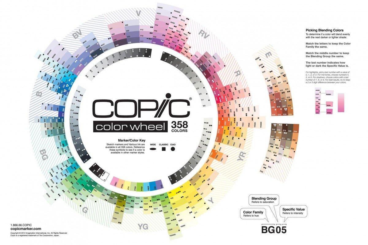
Here you will see that the reds in this group – with the exception of one, the darkest – are all from the same “spoke” on the Copic color chart. Choosing colors on the same spoke which represents the color value helps you get excellent blending. The darker red is to help emphasize those amazing shadows Michelle gets in her work.
Now you will see with the greens, Michelle chose “G” shades PLUS “BG” shades – the BG as you can imagine stands for Blue Green and these are what have added those beautiful tones of evergreen to her coloring.
Michelle also wants to note that she makes ample use of the Colorless Blender in her work. This allows her to seamlessly blend lighter colors without adding any more of any one color keeping them clear and pristine.

In the lighter and darker green areas she used a combination of blue green and green colors to get the evergreen feel to the image and in the lighter green areas used the same overall coloring technique, just switching to the lighter shades. You can see how this adds a truly beautiful effect of continuity using different shades of the colors.

For areas that are white in the design, Michelle used that extremely light blue violet and the colorless blender to add the faintest shadows. This helps add the dimension that Michelle is so talented at adding and make the white really POP. She then used a dark but bright blue to fill in the background areas to make the whole design “lift” off the panel.
For the cookies and the twine, Michelle used to very light earth tones – again choosing shades with the same color value – using varying layers of application to get the different depth of color saturation.

Truly gorgeous, right? And don’t you feel like now you might actually be able to try this out?
Next, Michelle is showing the same basic principles using brighter primary and secondary colors for our Birthday Slimline background stamp. She used the same technique of coloring with each color family through the whole project. Let’s check it out!

She used a very common three color collection of markers for the red sections, all in the R2 family and a set of three yellow reds – all YR2 shades – for the oranges. Can you see how these shades all work so well together to truly make things look dimensional?

She used some very basic yellows – Y1 shades – to keep those clear and bright and did the same with the greens with YG0 shades to perfectly complement the yellows.

She applied the same color strategy for the beautiful bright blues by sticking to the B2 colors in a group of three. Using a dark, medium and light gives you maximum shading with the darkest shade being your deep shadows, the lightest shade being where the light hits first and the medium shade to marry those two together and allow for that invisible bending Michelle is so famous for! For those tiny but impactful touches of purple Michelle used lighter shades and used them also in the “white” areas for that continuity, using her Colorless Blender to make those shadows subtle and perfect.
To add some contrast for the background – again, to help the focal images pop, Michelle chose a different value blue – B01 – and her Colorless Blender to fill in the little parts of the background that peek through, echoing the bright and cheerful tone of this project.

Here are the stamps AND our slimline mounting block (we’ve heard they are hard to find!) Michelle used today:

There is loads and loads of information out there on how to choose Copic marker colors for all kinds of coloring projects and we are SUPER thankful to Michelle for sharing some starter tips for those of us who want to up our Copic game!
Michelle, thank you for sharing your amazing Copic coloring skills. These background stamps are incredible, and you made them even more so.